Monday 25 November 2013
Thursday 21 November 2013
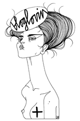
|| Black || The Greatest Colour in Fashion & Art? ||

Yves Saint Laurent once said that “black is the liaison which connects art and fashion,” supporting
Gianni Versace’s similar citation that “black
is the quintessence of simplicity and elegance.”
The colour of black wasn’t really introduced into fashion
until around the 14th Century, in which the status of black within
fashion and art began to change. The fine quality dyes began to be imported and
exported and soon arrived on the market. Initially black was to be worn by
governmental officials and magistrates, acting as a symbol of ‘importance’ and
‘seriousness.’
Black was the colour of power; of dignity; of humility and
temperance with the rulers of the European world basking in the symbolism of black.
 |
| Gustave Doreé || The Inferno, Canto |
In the 18th century black began to retreat as a
fashionable colour, and as Paris became the fashion capital of the world; the
powerful men and women of the world began adorning shades of pastels, creams
and colours – a sweet shops of colours.
Then came the Industrial
Revolution and everything changed. The cities of Europe and a-like became
stained black resulting in the art and literature of the time to reflect the
landscape – think Charles Dickens and
famous French artist Gustave Doré.
 |
| Henri Matisse || Potrait of Madame Matisse |
Within
the world of art, black was a controversial topic with some artists fully
loathing the colour within their works, whereas others, such as Manet, incorporated the colour in their
works to capture the lights and true emotion of the subject. In the 20th century black became the colour of
Fascism from counties such as Italy and Germany. However within art, black
regained some the territory is had previously lost in around the 19th
century.
In 1945, Henri Matisse (personally one of my favourite
artists) greatly expressed his love for the colour within his work, explaining
the significance and importance of the colour: “when I didn’t know what colour to put down, I put down black … Black
is a force: I use black as a ballast to simplify the construction … since the
impressionists it seems to have made continuous progress, taking a more and
more important part in colour orchestration, comparable to that of the double
bass as a solo instrument.”
 |
| Coco Chanel's 'LBD' |
In 1926 our beloved Coco
Chanel famously said this: “A woman
needs just three things; a black dress, a black sweater, and, on her arm, a man
she loves.” Along with her famous LBD – Little Black Dress – she helped to
revolutionize fashion, and of course the colour of black within fashion.
Women’s fashion became sophisticated and simplified, symbolising freedom
coinciding with chic. One of the most famous dresses inspired by this movement
is of course the one worn by Audrey
Hepburn in Breakfast at Tiffany’s,
designed by Hubert de Givenchy.
In the 1950s, black became the symbol of individuality and
intellectual and social rebellion, spanning from the leather jacketed greasers to the punk subculture of the
late 20th century.
Designer Ann Demeulemeester said that black is of “the purest of colours … the most poetic,
but at the same time strongest. It’s the colour of poets and writers and of
rebels.”
 |
| Coco Chanel |
Black within fashion is a recurrent feature, the only colour
that stays no matter what. No matter the season. No matter occasion. No matter
the style. Many speculate that black within fashion is greatly linked with the
economy and in a sense I agree. Black has been, and still is, a symbol for
various movements, subcultures and personal expression. Black became a way in
which men and women could fully express themselves without giving in to the
conformity pressed by society. It became is symbol of power, freedom,
individuality and rebellion, and symbol that, without even knowing, would
change the face of fashion and art continuously. Black is a colour that is
in-definitively adaptable to our surroundings, social status, economical
stance, and our political and moral movements.

Monday 18 November 2013
|| Monday Morning Motivation ||
I have recently decided to have a new segment: Monday Morning Motivation.
It will be a little quote or picture that I will try a post every Monday, just to motivate us all a little bit into not wanting to crawl back into bed and cry for the next century about having to go back to work/school/college.
I hope they will motivate you

Sunday 17 November 2013
|| New Cosy Front Room Decor ||
 After now living in our house for a year we had finally settled on what to do with the front room of the house. We originally had it as a dining room, but as it rarely got used (we just ate in the kitchen) it's now become a library come music room come living room without a tv. My dad likes to call it 'the library but generally my sister and I just call it 'the front room' - creative I know. After having the bookshelves and chairs in there for long enough, we thought it was time to finally paint it and finish it properly and after much deliberation on which colour, and which tone of colour and which brand would be best and all that sort of stressful but necessary planning we finally settled on Farrow & Ball's Brassica tone, a dark aged purple that it just wonderful.
My dad had recently painted the chest of drawers from a light blue which I, for the life of me, cannot remember to a lovely soft green colour called Pigeon, however leaving the wooden top of the drawers. We bought some door knobs from French Grey, (a fabulous interiors shop which I just want to buy everything every time I'm in there) purposefully getting mis-matched ones.
Me and my dad spent the day painting one wall of the room, me constantly saying 'oh it will only need one coat, I'm sure' and my dad saying the opposite. Obviously he was right because it did need two coats, as you can probably tell from the images below one coat was ever so slightly patchy. Whether that was to do with my painting or the paint underneath or just because it needed two coats I don't know, but what I do know is that once we did the two coats it looked absolutely fabulous!
The colour is so rich and strong and makes the room so cosy and comforting, and the green chest of drawers compliments the purple so well it was as if they were meant to be.
The room is now wonderfully cosy and perfect for just sitting and reading with a cup of tea (my favourite thing to do), one of the guitars is also in there as is the piano and is now a wonderful place in which to have a mini-music-sesh. My mum also has her desk in the bay-window of the room, which unfortunately I didn't take a picture of, making the room a perfect study space (also meaning you can people-watch perfectly well.)


|| THE FINAL OUTCOME ||

Subscribe to:
Posts (Atom)